Color gradients are used in a variety of plots in PASSaGE to represent continuous numerical values. While the colors can sometimes be controlled by the format options available to specific series, the PASSaGE gradient editor allows for more complex and subtle control over the color scheme. When an applicable series is selected from the list in the bottom left of the plot editor window, a bar representing the currently chosen color gradient appears in the right side of the screen. Clicking on this bar will open the gradient editor.
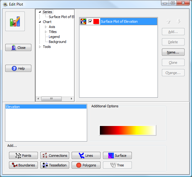
Edit plot window, with a gradient-capable series highlighted (Elevation) and its associated gradient bar shown under Additional Options. The gradient bar is a button; pressing it will bring up the gradient editor.
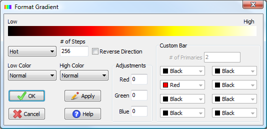
PASSaGE gradient editor.
PASSaGE contains four pre-defined color schemes: Grayscale, Rainbow, Hot, and Cool. In addition, a custom scheme can be created with up to 8 primary stop colors (the gradient runs from stop color to stop color). The number of steps controls the increments and coarseness of the gradient. The maximum and minimum number of steps are dependent on the exact set of colors chosen, but ranges from as few as two for a two color system to as many as 1,786 for an eight color system where the colors are all from the computer primaries (black, white, red, blue, lime, yellow, cyan, and magenta). The optimal number of steps depends on the type of gradient being applied. For surfaces, one will usually want a large number of steps (100 or more) to allow for a smooth gradient. For sets of colored symbols, one will usually want few steps (less than ten) since each symbol will be individually plotted as an independent series.
![]()
![]()
![]()
![]()
Built in PASSaGE color gradients: gray, rainbow, hot, and cool (top to bottom), each displayed with 256 steps.
![]()
![]()
![]()
![]()
Examples of the grayscale color bar with different numbers of steps: 5, 10, 100, and 256.
Other options include the ability to reverse the bar direction, to fix the highest or lowest values to black or white, or to adjust the red, green, or blue tint across the entire bar.
The new gradient will not be applied to the chart until the OK button is pressed. The Apply button redraws the sample gradient at the top of the window with the current options; it does not apply the gradient to the primary plot.
You may note that for many series with associated color gradients (e.g., color grids), the standard legend does not contain information on the meaning of the colors. A special legend for the color gradient can be added to the plot using controls outside of the standard legend. The gradient legend can be added to the chart using the following steps. First, choose the Tools item from the tree hierarchy in the center of the format window. Second, press the Add button. This will open a window called the “Chart Tools Gallery” containing a large number of tools that can be added to the chart. Choose the tool called “Legend Palette” and click Add (the other tools, of which there are many, are not discussed in this manual; while we find most of them to be of limited use, feel free to experiment). Now that the legend palette has been added to the chart, you need to associate it with a specific series, using the dropdown list box at the top of the window.
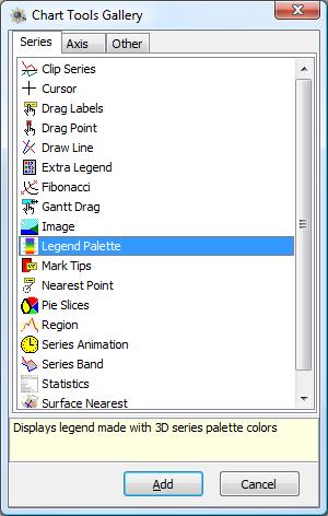
Chart Tools Gallery highlighting the Legend Palette.
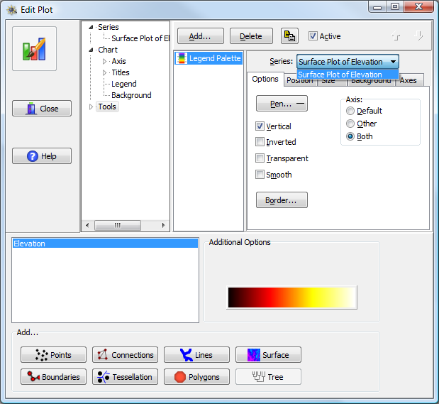
Legend Palette Options. You must choose which series to associate the legend with from the drop down box in the upper right; in this example we are choosing “Surface Plot of Elevation”.
The gradient legend will now appear in the upper left part of the chart. It likely will appear solid black; to fix this, press the Pen button (on the Options tab; above figure) and uncheck the box marked Visible. This will prevent the drawing of black lines around each class and should reveal the actual color gradient underneath. Other options including the position, size, scale, and font of the gradient are controlled by the various tabs and options in this tool window. Note that the gradient sits on top of the rest of the chart as an independent element; rescaling the window may change the position of the legend relative to the rest of the plotted elements (in fact, the legend can be floated over the underlying plot).
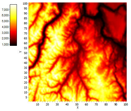
The elevation surface with a gradient legend added to the left-hand side.
If your chart contains multiple color gradients (e.g., masked surfaces or significance plots) you can add multiple Legend Palettes to the chart, attaching each one to a different series.