This procedure will draw a two-dimensional contiguous surface from a rectangular data matrix. The coloration of the surface can be controlled using standard gradation controls.
| Menu: | Draw→Map→Draw Surface |
| Button: | |
| Batch: | <none> |

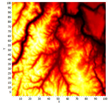
Example of a graphed surface. A 100x100 grid representing elevation in part of the northern Cascade Mountains of Washington. The diagram is shaded from black (low elevation) through red and yellow to white (high elevation).
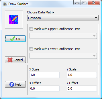
Because the positions of the cells within the matrix may not be equal to the actual coordinates each cell represents, one can specify X and Y offsets to indicate the beginning coordinates of the first cell. For example, if the first cell (row 1, column 1) of the matrix should actually be mapped at 50° E and 12° N, one could put 50 and 12 into the X and Y offsets, respectively to shift the matrix to those coordinates. Furthermore, each cell may not represent a single unit in the measurement system; the X and Y scale boxes can be used to set the size of a matrix cell relative to the coordinate system you wish to display the surface on. If each cell in the matrix is only half a degree, one could but 0.5 into the scale boxes in order for the coordinates of the plotted surface to match the actual coordinates of the underlying system. These options are generally only important if one wants the axes to display the correct coordinates or if one is trying to combine a surface with other mapped elements (e.g., point coordinates).

Draw Surface window and options.
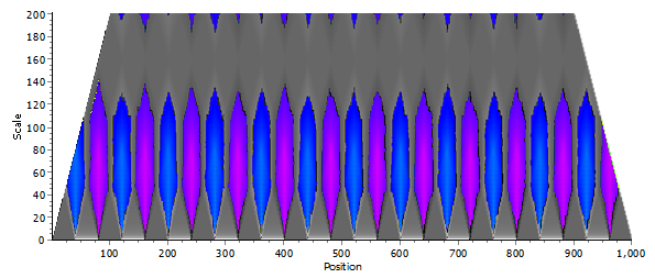
While surfaces will usually represent contiguous data on a map, they may also represent output from an analysis where both position in two-dimensions and color is important (e.g., the scale × positional variance plot from a one-dimensional wavelet analysis). In these cases, additional surfaces representing upper and/or lower confidence intervals may be available and one might wish to use these additional matrices to mask the output, such that only significant values are displayed. In these cases, significant values are plotted with one color scheme while non-significant values are plotted with a different color scheme. One can also chose to display only significant or only non-significant portions of the surface.

Example of a masked surface. The scale × positional variance plot from a one-dimensional wavelet analysis for a simple repeating transect. Significant values are drawn in color; non-significant values are drawn in grayscale.